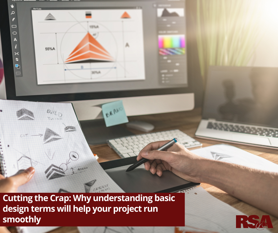
Cutting the Crap: Why understanding basic design terms will help your project run smoothly
– By #RSA
Many people have a creative mind and a keen eye for design. However, it may be hard to articulate your thoughts without understanding some basic design terms. Learning the lingo of graphic design will not only help bring you up to speed but it will also help you accurately describe what you are looking for in a design project.
The graphic designers at Robert Sharp & Associates have put together the following list of need-to-know terms and phrases related to graphic design. With these in your arsenal, you’ll be able to accurately communicate with your designer and ensure you both have an understanding of the goals for your end project.
1: Resolution/DPI
Dots per inch or DPI are a unit of measurement that identifies how many dots or pixels exist along one inch. The higher this number is the greater the resolution. Resolution refers to the quality of an image. The higher the DPI or resolution, the clearer the picture will appear. Images with a lower resolution can appear pixilated or blurry when they are resized. So when your graphic designer asks you for a high-resolution photo, don’t pull a thumbnail image off your website and call it good. Trust us, it won’t be good.
2: Vector Image
To put it in graphic design terms, a vector graphic is an artwork made up of points, lines, and curves rather than square pixels. What this means is a vector graphic can be resized and the lines, curves, and points will remain smooth, meaning you can manipulate the graphic without your image getting blurry. All logos should have a vector format so all your branded materials are professional, crisp, and clear. If you don’t have a vector version of your logo, contact the original designer to see if they do. Otherwise, you may be able to recreate a vector image from your .jpg.
3: Raster Image
Simply put, a raster image is the opposite of a vector image. Raster images typically end in .jpg, .png, or, .tiff. These are the types of images you take on a digital camera or your smartphone. While these file types are okay to use in certain instances, it is important to remember you are limited to how much you can manipulate them. For example, using the photo to fill an incredibly large space may make the image appear blurry.
4: Aspect Ratio
The aspect ratio of an image is the ratio of its width to its height. For example, when you post a photo on Instagram the ratio is almost perfectly square versus YouTube which is a wide rectangular shape. Understanding common aspect ratios are incredibly important in graphic design. Depending on how and where your design will be displayed should determine how you will lay out a page. Using the incorrect aspect ratio may cause part of your design to be cut off.
5: Bleed

A bleed is an extra space that extends beyond where you plan on cutting your page. Most printed materials need to be trimmed and a bleed ensures that none of your design is cut off. Bleeds are typically used when your design doesn’t have any sort of border and your image extends to the edge of the paper. Depending on what you are designing and the specific printer you’re using, your bleed may change. Typically, a 1/8th bleed is sufficient enough to guarantee none of your design is altered during printing.
6: Margins
A margin is similar to a bleed but slightly different. While a bleed is not printed, a margin is. The margin is the space between your final trim area and the image size area. A standard size margin is .25” on all sides of your document to make sure no content is cut off or too close to the outer edge.
7: RGB/CMYK/Hex code
As a business owner, marketer, or designer it is important to know the difference between different color processes. CMYK is a four-color process that is typically used for printed materials. CMYK stands for Cyan, Magenta, Yellow, and Black. CYMK colors are defined by the percentage of each four colors. RGB is the process used in web design and other digital marketing. RGB colors are created by using various combinations of red, green, and blue. RGB colors used in website designs are often represented by their hexadecimal values. This is a color code that all browsers can read. Hexadecimal colors are expressed as a six-digit value made up of numbers 0-9 and letters A-F. When developing a style guide make sure all colors are represented in CMYK, RGB, and their hexadecimal value.
8: Kerning/Leading
There is more to making the text in your design look right than just changing the font type or size. Kerning is the process of increasing or decreasing the space between individual letters. This is important in graphic design because sometimes the font you choose may make two letters appear too close or too far apart. Kerning helps you adjust the space between letters to make your design more legible. Leading refers to placing extra space between lines of text. This is important when using a decorative font with more flourish. Leading allows you to increase the amount of space between lines, making it easier to read and appear less crowded.
9: Visual Hierarchy
Visual Hierarchy refers to the arrangement of design elements to guide a viewer through the information. Information that is most important should appear first and in a larger font. Our eyes will naturally be guided to the most prominent aspect of a design. Visual Hierarchy improves the user experience and helps the viewer understand the message.
9: Die cut

Die-cutting is the process of creating products with a custom shape. Die-cutting is done after the printing process and can help enhance your printed items and help them stand out. Die-cutting is most commonly used to place a logo on unique packages such as wine bottles, lipstick tubes, and more!
10: Logomark
A Logomark is a mark or the symbol of a brand that does not include your company name or slogan. It is an image or an icon not accompanied by any text. For example, Nike’s iconic swoosh would be a logomark. Even without any text, you can tell what company is being represented.
Whether you are a designer, or a client looking for a new design, having an understanding of these terms will help you gain a better understanding of the design process and be able to better articulate your needs and wants. When it comes to graphic design it is very common to go back and forth making changes to colors, fonts, spacing, and more. With an understanding of these terms, you will be able to communicate with your design and make sure you are both on the same page right off the bat!
Last Modified:
